Condé Nast
2019–2020
ROLE Lead Product Designer
Overview
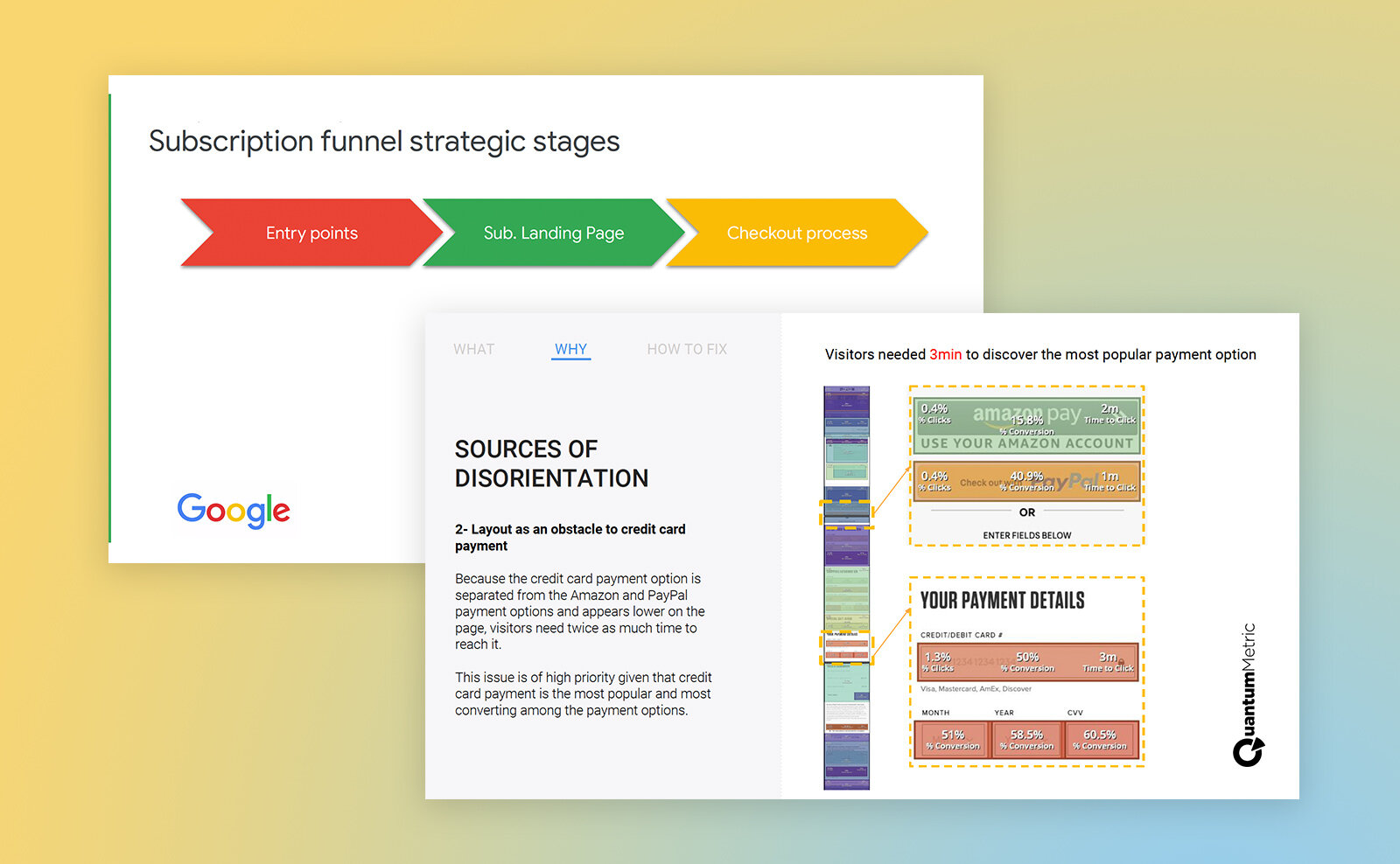
The checkout flow is the most important final step to converting a subscriber. It should be frictionless and easy to understand. Partnering with Quantum Metrics and Google, we did a deep dive into our conversion funnel.
Subscription offers
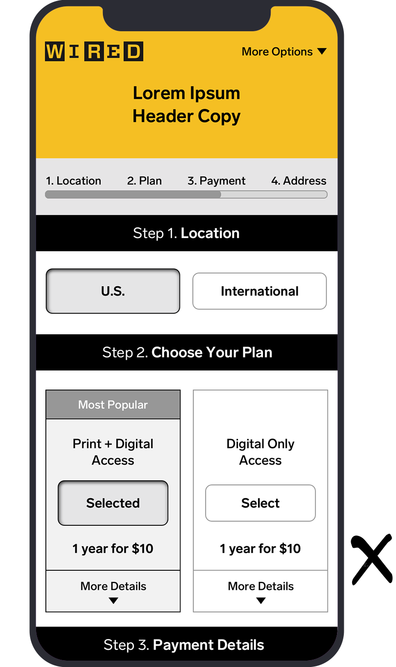
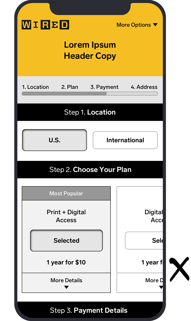
Problem: Users have an easier time evaluating plan offers side by side, but only two of three offers would be visible on mobile.
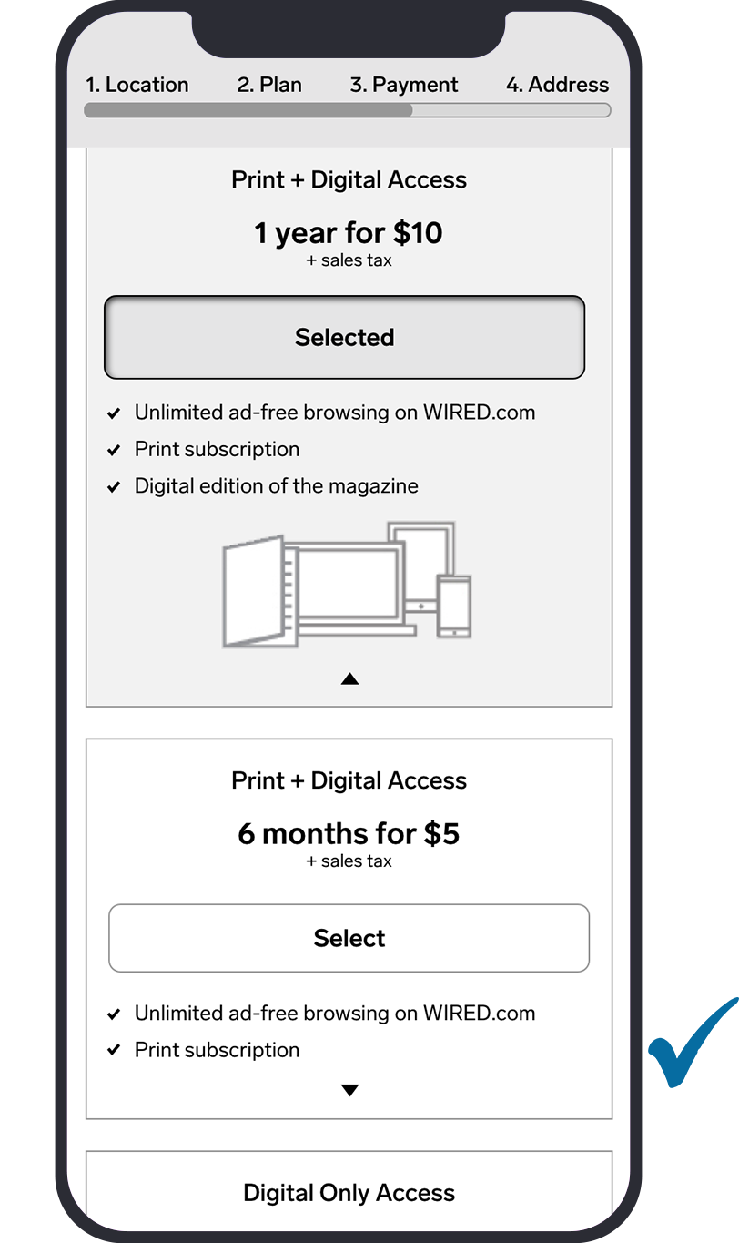
Solution: Show all three plan offers side by side on desktop. Stack on mobile but truncate details for non-selected offers.
Wireframe: Side by side only shows up to two plan offers fully
Wireframe: Horizontal scroll hides other plan offers
Wireframe: Stacked offers accommodates as many as needed
Location distraction
Problem: US visitors who interacted with country selection drop-down were up to 7% less likely to convert.
Solution: Default to U.S. and reveal country selector option once International is clicked.

Payment methods
Problem: Potential subscribers were getting caught up in the alternate payment methods, because quick pay options (amazon pay, paypal, etc.) were higher on the page than credit card. There was a high drop off rate among visitors who attempted to use these alternate payment methods, while those that made their way down the page to credit card fields had the highest rate of conversion.
Solution: Create one payment section that is higher on the page and default to credit card. Allow users to select different payment methods, and amend their preferred option before sending them to an outside vendor for completion.
Conversion success
The new WIRED order form was tested against the control and saw a 15% increase in conversion rates across desktop and mobile. We subsequently tested this form for The New Yorker, Vanity Fair, Vogue, Architectural Digest, Bon Appétit and GQ.

Results
Once we saw double-digit percentage increases in conversion rates from all tests—with especially significant numbers on mobile—we rolled it out across all titles. As well, more users were checking out with credit card, and there was a significantly reduced drop off rate for visitors that clicked on one of the alternate payment methods.
Condé Nast has never had an order flow that has won in testing across all devices, let alone all titles. Finally, an order form to rule them all! (For now… 😉)


